
T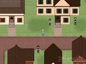 he last time we had a look at the hometown level (the setting for the Prologue chapter), I was experimenting with a chunk of turf in the land of bald, naked chibi people. Since then, the grass texture has been ditched in favor of larger texture sizes and the townsfolk finally have some clothed placeholder sprites.
Hometown exteriors
First, let’s have a look at the exterior levels. These are the ones with buildings, grass, and roads, as opposed to building interior levels, which we’ll look at later on.
Transitioning from 128 to 256 pixels
It’s a good thing I didn’t get much farther on the textures than the single tile of grass. I decided to up the size of the tiles from 128×128 to 256×256 pixels, which makes the world look much more crisp. That also means I have to scrap my grass texture and start over at the new resolution. This right here is the reason why I haven’t bothered to do any “real” art yet.
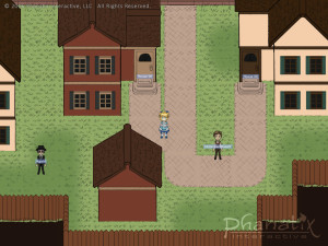 The higher resolution shouldn’t impact performance too much, though load times might be a bit longer in the end. Right now, it’s about the same as it was before, but I’m not done adding stuff yet. By the time this game launches, devices will probably be able to play it with the same level of performance across the board, mobile or otherwise. So I’m not worried about the increase in size.
Texture optimization
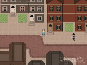 Aside from bloating my file sizes in favor of prettiness, I did do a thorough job of optimizing the tile bitmaps to be nicely square and powers of two. When I first started out, I wasn’t really sure how many tiles I would need in total, so it was hard to figure out the final bitmap sizes. I still have room for extra tiles if I need to add some variations to spice things up.
More building types
Speaking of spicing things up, you may have noticed there’s more variations of the building colors. There’s now a total of four different building sets, and each will have it’s own style of trimmings to make them unique. But for now, they’re hue shifted placeholders– Just enough for me to remember which ones are which.
Scrapping the park design
One of the things that bothered me about the Prologue chapter’s hometown level was that it’s lacking in level puzzles that are found throughout the rest of the game. I finally found a good place to stick in some puzzles where it actually makes sense story-wise: the park.
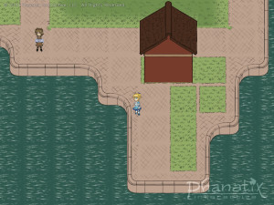 There’s a lot that goes down in the park area, it’s pretty much the only place in town where you can explore some wilderness and get away from the confinements of city life. It would be the perfect place to add some more dynamic elements to the chapter. However, I’m going to be tackling the park re-design another day. This is going to be a big overhaul, and there are other things I’d like to complete first.
No more birthday suits
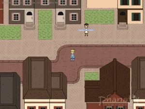 In the last article, I showed some of the main characters’ sprites. At long last, all of the NPCs are now clothed and with hair. It only took me a year to come back around to fixing them up. The townsfolk still need a lot of customizing, since I only made a few just to keep moving along. I’ll worry about that once I get around to modeling them in 3D. It’ll be easier to customize their clothes and hair to make new NPCs from previous ones.
Hometown interiors
Much of my time spent between my last update was working out how the interiors were going to work. Through trial and error, I eventually got a tile set of room pieces I was happy with.
Starting fresh
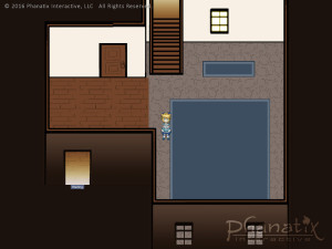 I pretty much just started over when it came to interiors. Originally, I had made some quickie placeholder walls and floors to form plain rectangular rooms with little regard to what shape the buildings actually were. It was enough to get the events that took place indoors sequenced and playable in the first iteration. For the second time around, I made tiles to handle the nooks and crannies of the actual shapes of the buildings. Again, these are still placeholder– the final tile art will be rendered in 3D. That won’t be for a while though.
Tile ratios
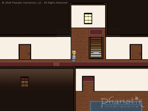 When redoing the interior tiles from scratch, the big difference was a new interior/exterior size ratio. You’ve probably noticed in most sprite based games that the interiors of buildings are much larger than what they look like on the outside. I needed a common ratio to work with with building interiors. I originally thought 1:3 (one exterior tile to every three interior tiles) would end up looking the best, but that was too big; a 1:2 ratio worked out better. That does some weird things to tiles though. A single door tile on the outside needed to transfer to 2 tiles for an interior. Same thing goes for windows. Though when you play the game, you won’t notice this. They just looks like regular ol’ doors and windows.
Adding up
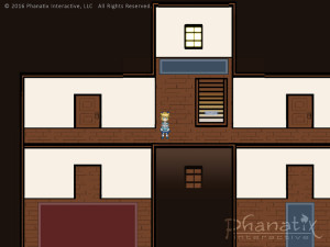 Once I finish adding in all the interiors, there will be fifty five Unity scenes comprising the hometown level. There might be a few more, depending on how I break up the park level in the redesign. In any case, this is a giant level in its entirety, so hopefully you guys will have plenty to explore once it’s ready to go.
Continuing Refinements
That concludes this update on what I’ve been working on (without dropping any spoilers). I’m going to continue fleshing out the hometown level placeholders and diversifying the NPCs who inhabit it. I’m itching to start building final assets in 3D, but I need to resist the urge to bust out my old friend 3DS Max for a little while longer. It’ll be fun to do a comparison of “before” and “after” screenshots once the final assets are in. It won’t look anything like it does now.
Leave a Reply